Dark mode done properly: contrast, color and images
How to build a dark mode that holds up: layered surfaces, brand colors that don't glare, contrast checks, images, icons and a test routine for both platforms.
 Sanne Verbeek · · 9 min read
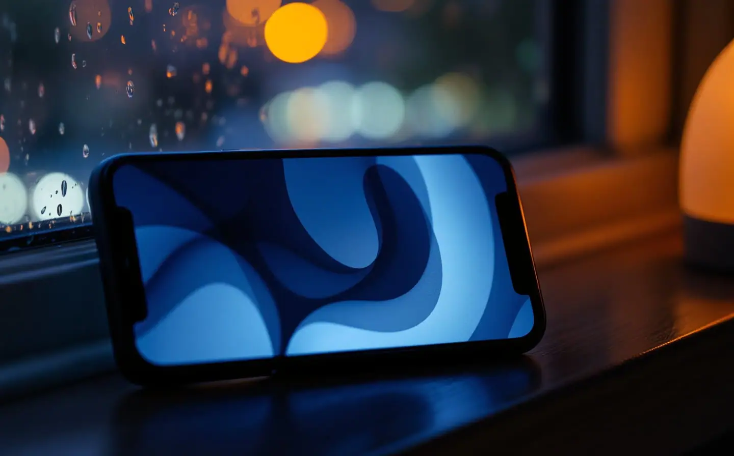
In early November the streetlights in Amsterdam come on before five, and on the tram home nearly every screen I can see is dark. Most of those apps look fine at a glance. Then someone opens a product page and a white photo background flares out of the screen like an open fridge door, or a brand-blue button sits on near-black and seems to hum at its edges. Dark mode rarely fails as a whole. It fails in the details nobody checked after the second color set went in.
I've argued before that dark mode should be a second set of values for the same semantic color names, not a parallel design. This piece is about what goes into that second set, and about the parts that tokens can't fix: images, icons, embedded web pages, and the moment the system switches appearance while your app is open.
Start with what the platforms already decided
Both platforms treat dark appearance as a person's system-wide choice, and they disagree on one point worth settling before anyone designs a settings screen. At the time of writing, Apple's Human Interface Guidelines on Dark Mode advise against an app-specific appearance setting: people would have to change two settings, and an app that ignores the system choice can look broken. Android's dark theme guidance describes an in-app choice of light, dark or system default, and recommends system default. For a cross-platform team my rule is simple. Follow the system on both, and add an override on Android only if people ask for it.
Apple's page also makes a point that is easy to forget: the dark palette is not an inversion of the light one. Backgrounds get dimmer and foregrounds get brighter, and some colors change while others stay put. People can also choose Auto, which changes the appearance with the time of day, possibly while your app is on screen. Keep that in mind; it comes back in the testing section.
Surfaces: depth without shadows
In light mode, shadows do most of the work of separating layers. In dark mode they nearly vanish, because a dark shadow on a dark background has nothing to show against. Both systems solved this the same way. Higher layers get lighter.
On iOS, dark mode uses two sets of background colors: a dimmer set for the base layer, and a brighter set for interfaces that sit in front of it, such as sheets and popovers. The switch between them happens on its own if you use the system background colors, which is the best argument for not painting your own. A custom near-black background looks identical inside a sheet and behind it, and the sheet loses its edge.
Material reached the same place through color. Its baseline dark theme uses dark gray surfaces rather than black, which keeps shadows visible and is easier on the eyes with light text. In Material 3, tone-based surface roles replaced the older overlays that marked elevation levels one to five. In Compose these are the surfaceContainer roles, from surfaceContainerLowest to surfaceContainerHighest, plus surfaceDim and surfaceBright, which stay dimmer or brighter than the plain surface in both themes. Pick the role that matches how much emphasis a container needs, and the dark version follows.
If you design custom surfaces, decide on purpose whether your darkest layer is black or a very dark gray, and make every layer above it a visible step lighter. The mistake I see most is not the choice of black. It's three surfaces that are all the same dark, so a card, a sheet and the page behind them merge into one slab.
Color: brand colors need their own dark values
The brand color is where most dark themes go wrong. A saturated blue or red chosen against white usually looks heavier and harsher against a dark surface, and when it's used for small text it often fails contrast as well. The fix is a lighter, softer variant of the same hue for dark mode, defined as the dark value of the same token. Material's dark schemes already ship adjusted values for primary, secondary and tertiary rather than reusing the light ones; if you build your own palette, do the same by hand and judge it on a real phone, not a calibrated monitor.
Some colors should not change at all. A colored badge that identifies a category, or a status color people have learned to recognize, can be confusing if it shifts between appearances. Material 3 added fixed accent colors for this case, which stay the same in light and dark themes. On iOS you can get the same effect with a color set that has one value for both appearances. Use them sparingly, and check that each fixed color still has enough contrast against both backgrounds.
Contrast, checked in the dark
Apple's guidance gives a floor of 4.5:1 between colors and asks you to aim for 7:1 for custom foreground and background pairs, especially for small text. It also asks you to test dark mode with Increase Contrast and Reduce Transparency turned on, separately and together, and to supply an increased contrast variant for each custom color. Material's color roles support three contrast levels that people can choose between. The WCAG basics are in my mobile accessibility checklist, and the pattern I described there still holds: in dark mode, secondary text and placeholder gray fail long before primary text does.
There is one more reason to define dark values even for an app that ships in light only. Since the Liquid Glass redesign, bars and controls made of that material adapt between light and dark depending on the content underneath. At the time of writing, Apple's color guidance asks for both light and dark colors so your colors survive that adaptation.
Images: the part tokens can't reach
Tokens handle text, fills and lines. Images need decisions of their own, and they are where a carefully built dark theme most often looks unfinished.
Product photos on white
Apple suggests slightly darkening content images with white backgrounds so they don't glow. You have three options: ask for cutouts with transparent backgrounds, show the photo on a deliberately light tile so the white looks intentional, or apply a small dimming overlay judged by eye on a device in a dark room. For shops with thousands of supplier photos, the light tile is usually the only realistic choice.
Illustrations and interface icons
An icon with a thin black outline disappears on a dark surface, and a soft drop shadow turns into a smudge. Apple's guidance suggests separate light and dark versions where needed, combined in the asset catalog under one name, and SF Symbols tinted with dynamic colors adapt on their own. On Android, use theme attributes or night-qualified resources rather than drawables with a fixed color baked in. Empty state illustrations deserve a dark pass of their own, since they're often the largest image a new user sees.
People's own photos
Leave them alone. Dimming an image someone took is changing it, and nobody asked for that.
Partner logos and payment marks
Many brands publish a version for dark backgrounds. Use it, rather than placing a dark logo on a white rectangle.
App icons
On iOS, people can choose default, dark, clear or tinted icons for the Home Screen. Apple suggests basing the dark icon on the light one and keeping its core features the same; the system generates any variant you don't provide, and a generated one is rarely as good as a designed one. On Android, themed icons have used a monochrome layer since Android 13, and from Android 16 QPR 2 the system themes icons for apps that don't provide one.
Embedded web content
Help pages, terms and checkout steps often load in a web view and stay bright white inside a dark app. For apps targeting Android 13 or later, WebView sets prefers-color-scheme from the app's theme, so pages that define a dark style pick it up; for pages that don't, you can allow algorithmic darkening. The better fix is on the web side: give those pages a real dark style.
Force Dark is a draft, not a design
Android 10 introduced Force Dark: opt in with android:forceDarkAllowed="true" in the activity's theme and the system analyzes each view of a light-themed app and darkens it before drawing. It doesn't apply if your theme already inherits from a DayNight theme. It's a useful afternoon experiment, because it shows you quickly which screens are going to be trouble. It isn't a substitute for a dark palette, and individual views can be opted out when the result is wrong.
When the appearance changes mid-session
Auto appearance means the switch can happen while someone is halfway through a task. On Android, a theme change triggers a uiMode configuration change and activities are recreated, so anything not saved in state is lost: a half-filled form, a scroll position, an open dialog. On iOS the trait change reaches your views, but values resolved once and cached, such as a color converted early or an image rendered into a buffer, stay in the old appearance until something redraws them.
What usually breaks, and the fix
| Element | What goes wrong in dark | Fix |
|---|---|---|
| Product photo on white | Glows like a lamp | Light tile, cutout or slight dimming |
| Brand color button | Looks heavy, edges vibrate | Lighter dark value for the same token |
| Secondary text | Fails contrast | Check the pair in dark, raise the tone |
| Raised card or sheet | Merges with the page | Brighter surface role for higher layers |
| Hard-coded white background | Bright rectangle | Theme background color or attribute |
| Outlined icon | Outline disappears | Dark variant or a tinted symbol |
| Web view page | Stays white | Dark style on the page, darkening as fallback |
A test routine for both platforms
- Walk every screen the release touched in both appearances, on one iPhone and one Android phone.
- On iOS, turn on Increase Contrast, then Reduce Transparency, then both, and repeat the screens with the most custom colors.
- Open a form, fill half of it, and switch the appearance from Control Center or Quick Settings. Nothing you typed should disappear.
- Check every screen with images: product pages, profiles, empty states, onboarding.
- Look at the app icon on the Home Screen in each appearance next to the system apps.
- Add both appearances to your snapshot tests so a light-only color can't sneak back in; the setup is in Michał's snapshot testing field guide.
- Use the app once outdoors in daylight and once in a dark room at low brightness. Apple's color guidance makes the same point: colors look darker and more muted in bright light and brighter and more saturated in the dark.
More interface pieces live in the app design track. For this week, try step seven first. Tonight, when it's dark by five, turn the brightness down, open your app in a dim room and scroll until something glows. That image or that button is your first ticket.
Keep reading
Design systems for small app teams: start smaller than you think
How a small app team can build a design system that lasts: tokens first, a dozen components, notes in the design file, clear names and a first month plan.
App store screenshots that explain the app in five seconds
How to plan app store screenshots that work at search size: what the first three must show, how to write captions, and how to handle languages and dark mode.
Mobile app accessibility: a working checklist for small teams
A release by release accessibility checklist for small mobile teams: screen readers, text scaling, touch targets, contrast, icon labels and motion settings.